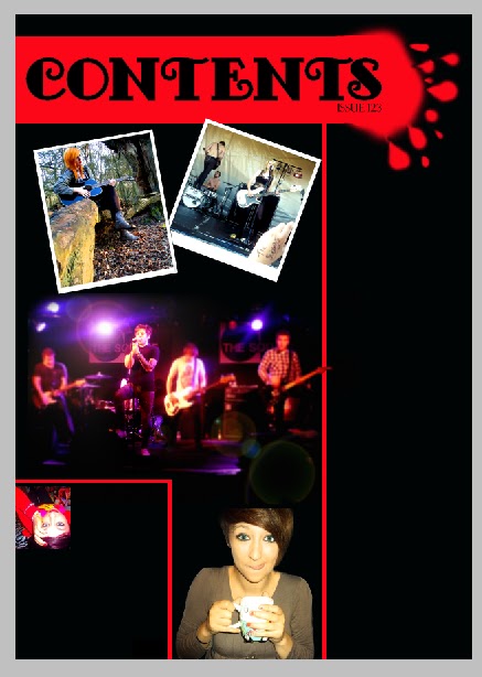
 I'm now continuing with my contents page. The next stage was to add my images. This took quicker than I expected. I opened up the main image i was using in a new photoshop window. I added more contrast and made the vibrancy higher to make it look brighter. I also darkened the shaddows so that the background was darker, which I hoped would blend in with my background more. I then used the rectangular marque tool to select it and copy and paste it into my contents page. When I did this however, the image was far too big and took up the entire page! This was definitely not good! So I deleted it's layer and tried again. This time I had to rezise it, so i went to *image-image rezise* on the top menu and began to play around with the sizing, starting off by reducing the size and re-pasting it onto my contents page. It was then too small. I kept repeating my previous steps using trial and error until I finally got the size I wanted. Once it was onto my contents page, I then used the paint brush tool at 50px diameter with an edge hardness of 0% to colour in the edges of the picture black and allowing it to blend in with the background more so it didn't look too 'stuck on' and moved the image into the middle of the large section of the page.
After being extremely pleased with the turn out of the image on the page, I began on my other images, starting with the one of the subways. I opened it in a new photoshop window and resized it first, making sure it fitted using my experience from the last photo. I then make the image brighter and added more colour saturation so it was a bit warmer. I then selected sections around the edge usig the rectangular marque tool and used the paint bucket tool to fill them in white so that it looked like a poloroid picture as planned. I then went to the top menu and went to *image-image rotation-arbitrary...* and changed it to 20degrees clockwise. The image rotated too far for my liking so I went back and changed it to 10degrees. The image looked better this time. Another problem I then faced was I couldn't use the rectanguilar marque tool to move it, so I had to use the polygonal lasso tool to select around the edge of the image. I then cut it and pasted it onto my contents page and moved it to the top right corner.
Adding the image of sophie was then proved easy due to needing to do exactly the same thing as I did with the Subways photo. However, this time, I also adjusted the colours so there was more yellow through it, making it look warmer and day dreamy. I added my border and I then resized it and rotated it 10degrees anti clockwise onstead of clockwise. Using the same method with the polygonal lasso tool, I cut out the image and pasted it onto the contents page, then moved it into position.
Adding my final main picture wasn't as problematic as my top two images, however, it still fared tricky. I started with just adjusting the saturation to make it warmer and the contrast to make it more defined before adding the picture in to the contents after resizing it and copying and pasting it in from a different window. I then realized it looked separate from the rest of the page so I tried using the brush tool with a black brush with a soft edge to blend it into the rest of the image, however, this didn't work too well. it looked obviously painted around and looked odd. I then decided to cut around the edge of Megan, as initially planned, to separate it from the rest of the page and make it blend in at the same time. I cut her out and pasted her on the contents page. This looked far better than before she was cut out and I was pleased with the outcome.
Adding the editors letter photo after adding in all of these previous photo's was a doddle! So I set off the same way as before, opening it into a new window and making it a lot smaller before copying and pasting it into the contents page and putting it in position. Finally.. all of my pictures are in!
No comments:
Post a Comment