Wednesday 14 September 2011

Andrew Goodwin's Theory.

In Andrew Goodwins book 'Dancing in the Distraction Family',(1992) identifies a number of key features which distinguish the music video form.
The key features he identified are as follows:
  • There is a relationship between the lyrics and the visuals (the visuals illustrate, amplify or contradict the music.)
  • There is a relationship between the music and the visuals. (the visuals illustrate, amplify or contradict the music.) 
  •  Particular music genres may have their own style music video. (the video represents a steriotypical genre.)
  • There is a demand on the part of the record company for close ups of the main artist.
  • There is likely to be a reference to voyeurism particularly in the treatment of females, but also in systems of looking. (screens with screens, binoculars, camera's, keyholes etc.)
  • There are likely to be intertextual references, either to other music videos or to films and TV texts.

Friday 1 April 2011

My Magazine Cover, Contents Page and Double Page Spread:

Overcoming the final little problems.

After saving and printing my double page spread, I had a problem. The article text was across both pages, making it look unprofessional and all over the place, and I wasn't sure on the the text over the picture on the left page, and thought the quote would look better in the text. So i set out to change it all about. I started off by making the text in my article smaller, allowing more room to move it over and to add in the quote. I then made the text boxes smaller so that they where completely on the right hand side with extra room left over, which made the image on the left hand side also look bigger and more important, which was my initial aim. I then changed the quotes centering in the text box to 'central' and made it white so it would blend in with the article more, making it look part of it, yet separate at the same time due to it's size and how it's layed out. I then moved the text box into a gap between paragraphs that I'd made in the text, just before the paragraph it is featured in. I then moved the list of the band members into the other bottom corner under the article and out of the way and made it white so it wouldn't stand out too much. I left it slightly bigger than the article so it was still noticeable.

I feel making these changes has definitely improved my double page spread and I am much happier with the new layout and look of it. Here it is:

Making my double page spread.

I started of making an A4 size canvas and swapping the width and height around so it was landscape. I then filled it in black and opened my picture in a new window. I then adjusted the pictures contrast so the subjects stood out more and where brighter, whilst the background was darker, creating more depth. I adjusted the saturation so that the image had more colour abd brightness to it, meaning the eye will be dragged to it easily. I used the cropping tool to cut out the drums and then changed the image size to half the size of my double page spread's canvas. I selected it with the rectangular marque tool and I then copied and pasted it into my double page spread, where it seemed to fit perfect! I placed it on the left hand side of the page in the bottom corner, so the image looked like it was part of the background, with no hard edges around the image. I then used the black paintbrush tool woth a 75px diameter and 0% edge hardness to shade out the uneccessary backround and make the image look even more so like it's part of the background which makes it look a little less in-your-face and easy on the eye.


Next came adding in the heading. This was easy. I simply created a new text layer and wrote ' "Let there be ' in it. I made it white and the same font as the contents and cover, 'Roxwell'. I left it in lower case to look like a quote from the text which is what it is. I then created another text layer and wrote BITE in the same font as my contents title and masthead, which also keeps consistency and brands it as a 'Novocaine' spread. I rotated it with the little tool that you find when you move your mouse outside of the text box. I then made it a lot larger than the rest of the heading and make it red so it really stood out from the rest of the heading, just has I had intended. I put it into place, then added another text layer, writing just ' " ' inside it, putting it just after the word 'BITE' to sypmolise the end of the quote. I made this the same colourt and font as the beggining of the title.


I then moved on to add in the other two images. I opened them bith in new windows and resized them right down. I adjusted both of the saturation, to make them boith brighter, and changed the contrast so they looked deeper and stood out more. I then selected them both and copied them both into my double spread. I then moved them both into the top right hand corner.

I then began to add in my double page spread. I started of by adding in my opening line. I opened a new text box and inserted the words "They might be young and pretty , but they certaily aren't bubblegum pop puk, even if your nan approves! ". I made them the same font as the rest of the article and the heading. This means it will look like it's part of the article due to it matching it. It's bigger to stand out and I've made the text box longer and across both columns to make it look bolder and noticeable. I then started to put in my article. I created two text layers and put them where I wanted to the article to be. I copied my article from the word document and pasted it into the text boxes, dividing it between the two. I had a lot of trouble with this as the font was only 2px but was still too big and seemed to out of proportion. I then discovered that my page was too small. I had to change the size of it to A3. This proved a challenge. On my first attempt, I made it over 100cm's too big, and had to completely undo it, which due to it's size, took AGES. I then learnt from this mistake and made sure the scale was in millimetres. This worked a lot better and the entire contents of the page changes with it, remaining in proportion.. Job well done! I then Noticed the font size was more normal and was about 6px. It looked in proportion, tight and compact, which I found works well the article, making it look less to read but filled with writing.

I created a new text layer, where I put my quote from the article saying "We're big, intelligent and technically excellent... Because that spells BITE!" in it. I made It made it bigger than the text of the article and in red instead but with the same font. This means it looks separate from the article, but also part of it. I placed it in the bottom left corner over the image to also separate it from the article and to add more onto the right hand page. I then created anew text box stretched across the bottom of the right hand page and wrote down the band members and their role in the band, as the audience like to know who they're reading about. I made it small so it's separate and out of the way and red to make it still a bit noticeable. Once I'd done this.. MY DOUBLE PAGE SPREAD WAS COMPLETE!

The pictures for my double page spread.

So off I went to a BITE gig and got in FREE! which was very kind of them.. anyway, I got out the camera and started snapping away with all of my plans in mind. After several attempts at every shot, I finally caught some winners! So here they are...

This will be my main point of focus on the page. It will be the image in the center of the left hand page that takes up the entire page. It's at a slight low angle instead of the planned eye level, however, I feel this is more appropriate as it looks like we're at the front of the stage, looking up. It's a long shot to show all of my mise-en-scene including the lights on them, the stage, the equiptment and the instruments. I have them standing further to the right of the frame to make it seem as if they're playing to the where the text of my article is, as if it's all centered around them. I think I will cut off the drums and blend the image into the black background with the paint brush tool to make them more 'a part' of the background. I think the contrast will need to be changed to define them more, and the saturation made higher to make it brighter to catch the eye. I am pleased with this image however, as despite the angle, it's very similar to my plan. Success!

 My second image was a huge success! It's a little wider than I had planned, however, it won't take a minute to crop out the bit I won't need. I like how the light shines towards him, and I like how he's towards the left hand side. I like how the colours are bright but not too bright, compared to the dark background. It sticks with the low angle theme but is a medium shot to add more variety and get closer up to the band. I used this particular distance to show the light behind him, as well his guitar and his face to show exactly what he's doing.. playing. This image will be one of the small images at the top of the right hand page above the writing.

This is my final image that will be used on my double page spread. I like how, varied to the other image, he's directly in the center. I made it a medium long shot of him playing to try and cut out all the action around him so the audience focus' on him, but so the instrument is also in the frame, to show he's the drummer and that he's currently playing. With all of the image subjects looking purposely away from the camera, it looks as if they're getting into the songs and just concentrating on their audience which is what I had intended as it fits with my article on how they're taking everything seriously. I have managed to get the guitarists hand in the image unintentionally, but that can easily be cropped out. I feel that the image is a bit dark with little light source, so I will adjust the brightness to it's brighter, adjust the contrast so he stands out more, and adjust the saturation to highlight any colours in the feature so that it still draws in the eye.

Overall, I'm pleased with all the images I have taken and produced and hope that they'll be easy to work with!

Article for my double page spread!

So I've written up my article that will be featured in my double page spread, and after a lot of deciding between quotes, debating on the layout, deciding what's too formal, what's to informal, what sounds good, what sounds cheesy and what's just ridiculous .. I'VE DONE IT! or at least, I've written an article that makes sense. I just hope it's not too long! Here it is:


They might be young and pretty, but they certainly aren’t bubblegum pop punk, even if your Nan approves.

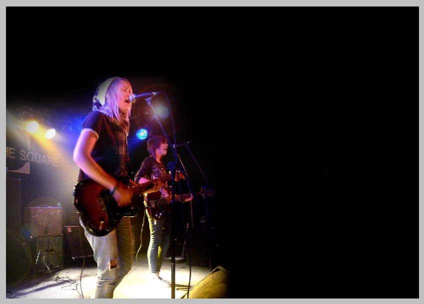
Make way United Kingdom, and push aside your old vinyl records of every classic rock and roll band you’ve ever known, because this is a new generation and BITE are taking centre stage to rock the music scene of today and prove that modern rock is mind blowing. They’ve got the look, they’ve acquired the sound and they own the stage, looks like BITE are onwards and upwards.

So how would you describe yourselves? “We’re big, intelligent and technically excellent... because that spells BITE! And no, that is not why we’re called BITE, the names origins are completely unknown, even to us!” laughed Jamie. I guess we all love a bit of mystery amongst our heroes, but if you can’t even remember how you came up with your name, is there much point us asking how you formed? “ Now that we do know, so long story short... one day god said ‘let there be BITE!’ and here we are, ready and waiting to hit the scene!” Jamie told us which shortly followed with a synchronised “CRINGE” from the band, I guess that was a bit cheesy there jay! But despite the cheesy caption lines, and their young, pretty front, these kids are serious. They mean business!

Since the beginning of 2010, these guys have been living the high life, pushing their way up through well renowned bands and mingling with the rock stars. “Our favourite gig was probably supporting Red Light Company and Goldhawkes because they where both amazing. I’d heard of RLC before, we’d seen them on TV and loved their music so we where well buzzing! Then seeing goldhawkes during their sound check was incredible, they had a sound that was so big and so meaningful!” explained Jamie, “It really inspired us!” Since then, the band have gigged with many more people including The Subways and will soon to be playing with Bob Geldoff’s band, The Boomtown Rats. Amber added “We’re so grateful to be gigging with all the bands we play with, they’re often incredible and seeing how far they’ve come urges us to push ourselves further and further to achieve the best that we can give”.

However, whilst these youngsters are shooting into this serious, tough world of travelling miles to late night gigs, messy audiences, tough-to-please critics and rioting fans they remind us it’s not all hard work and no play. “We’re always mucking about with each other and playing ridiculous games. We favour winding up Charlie, he just takes it, I guess that’s the fun of it!” Jamie told us, sounds like you kids know a good joke then? “Amusing things seem to just happen to us! One time, me and Charlie where backstage at a gig where we were supporting another band that I was very fond of when the guitarist of the band (I won’t mention names) walked in. Everything just went silent. He grabbed what he needed and as he walked out he tripped over his guitar case. It was the hardest thing in the world not to laugh so we had to wait until he was gone, then laughed so hard that we cried!” I think we all would have Jamie! But has anything embarrassing happened to you? “Well we’ve blown a few amps, and one of them wasn’t ours, Charlie’s broken plenty of sticks and a snare, and I think Ambs should carry this one on..” Oh really Amber? So what happened? “Well. At Pearfest in 2009, I looked down at what I was playing, looked back up and added a smooth hair flick only to smack my head on my microphone. There was a huge thud and a roar of laughter, but I can honestly say I thought it added to the entertainment we gave.” With all the fun and frolics, including on stage, anyone who’s not seen these kids are certainly missing out on a good time!

At the ages of 17 and 18, the band have already recorded their first EP and are heading for their debut album of which most has been recorded at Escape Route Studios. “Last time we where at Escape route was last summer and the weather was perfect for being in the middle of nowhere! The atmosphere was just so relaxing. Recording is always so much fun and so are the guys who work there, they’ve helped us a lot to get the sound we want, which to be honest, is invaluable! We do, however, spend these weekends loaded up on pot noodles and drank so much Redbull that we ended up pretty burnt out by the end of it.” Giggled Heva, we can tell none of you are at all health conscious! “Walking into
Abbey Road
’s studio 2 is definitely the most memorable moment of my life so far. It was just unreal!” Jamie told me, “I felt like a rockstar, like I was important and famous, I was on top of world!”. Charlie, a man of few words, added “It was a beautiful moment, one of the best the band have shared!”

BITE have also recently produced a music video that is set to hit the screens in a few weeks! It’s promised to be dark, twisted and captivating with a black humoured twist. It must be strange to see yourself in a music video, was the experience what you expected then Amber? “It was exactly what we expected and more! I don’t wanna tell you much because you’ll all have to check it out for yourselves, but the entire day was brilliant! We ended up soaking wet and wrecking the place, it was far more incredible than we had ever imagined!” So it looks like we’re going to have to just keep a look out guys, sounds like it’s going to be pretty epic! They’re also already lining up yet another video “full of blood, guts, gore, infected people and zombies. Lots and lots of blood spurting zombies!” according to Charlie... that could be even messier than the last video guys!

“Coping with this level of fame is certainly proving difficult. I’ve found myself swamped with screaming teenage girls begging for my plectrum and picture several times now and, to be honest, I’m not exactly flattered, more so petrified!” explained Jamie, proving that even the highlights can prove tough, but I’m sure that’s pretty worth it when it comes to climbing the popularity ladder with leaps and bounds within today’s music scene. By the sound of it, BITE are certainly about to hit big time, and we’re going to welcome them with open arms! They’re eye candy AND they’re full of charm, talent and plenty of potential, what’s not to welcome?