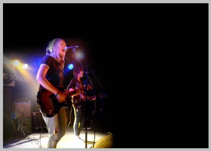
I started of making an A4 size canvas and swapping the width and height around so it was landscape. I then filled it in black and opened my picture in a new window. I then adjusted the pictures contrast so the subjects stood out more and where brighter, whilst the background was darker, creating more depth. I adjusted the saturation so that the image had more colour abd brightness to it, meaning the eye will be dragged to it easily. I used the cropping tool to cut out the drums and then changed the image size to half the size of my double page spread's canvas. I selected it with the rectangular marque tool and I then copied and pasted it into my double page spread, where it seemed to fit perfect! I placed it on the left hand side of the page in the bottom corner, so the image looked like it was part of the background, with no hard edges around the image. I then used the black paintbrush tool woth a 75px diameter and 0% edge hardness to shade out the uneccessary backround and make the image look even more so like it's part of the background which makes it look a little less in-your-face and easy on the eye.
Next came adding in the heading. This was easy. I simply created a new text layer and wrote ' "Let there be ' in it. I made it white and the same font as the contents and cover, 'Roxwell'. I left it in lower case to look like a quote from the text which is what it is. I then created another text layer and wrote BITE in the same font as my contents title and masthead, which also keeps consistency and brands it as a 'Novocaine' spread. I rotated it with the little tool that you find when you move your mouse outside of the text box. I then made it a lot larger than the rest of the heading and make it red so it really stood out from the rest of the heading, just has I had intended. I put it into place, then added another text layer, writing just ' " ' inside it, putting it just after the word 'BITE' to sypmolise the end of the quote. I made this the same colourt and font as the beggining of the title.

I then moved on to add in the other two images. I opened them bith in new windows and resized them right down. I adjusted both of the saturation, to make them boith brighter, and changed the contrast so they looked deeper and stood out more. I then selected them both and copied them both into my double spread. I then moved them both into the top right hand corner.
I then began to add in my double page spread. I started of by adding in my opening line. I opened a new text box and inserted the words "They might be young and pretty , but they certaily aren't bubblegum pop puk, even if your nan approves! ". I made them the same font as the rest of the article and the heading. This means it will look like it's part of the article due to it matching it. It's bigger to stand out and I've made the text box longer and across both columns to make it look bolder and noticeable. I then started to put in my article. I created two text layers and put them where I wanted to the article to be. I copied my article from the word document and pasted it into the text boxes, dividing it between the two. I had a lot of trouble with this as the font was only 2px but was still too big and seemed to out of proportion. I then discovered that my page was too small. I had to change the size of it to A3. This proved a challenge. On my first attempt, I made it over 100cm's too big, and had to completely undo it, which due to it's size, took AGES. I then learnt from this mistake and made sure the scale was in millimetres. This worked a lot better and the entire contents of the page changes with it, remaining in proportion.. Job well done! I then Noticed the font size was more normal and was about 6px. It looked in proportion, tight and compact, which I found works well the article, making it look less to read but filled with writing.
I created a new text layer, where I put my quote from the article saying "We're big, intelligent and technically excellent... Because that spells BITE!" in it. I made It made it bigger than the text of the article and in red instead but with the same font. This means it looks separate from the article, but also part of it. I placed it in the bottom left corner over the image to also separate it from the article and to add more onto the right hand page. I then created anew text box stretched across the bottom of the right hand page and wrote down the band members and their role in the band, as the audience like to know who they're reading about. I made it small so it's separate and out of the way and red to make it still a bit noticeable. Once I'd done this.. MY DOUBLE PAGE SPREAD WAS COMPLETE!

No comments:
Post a Comment