Wednesday, 26 January 2011
Analysis..
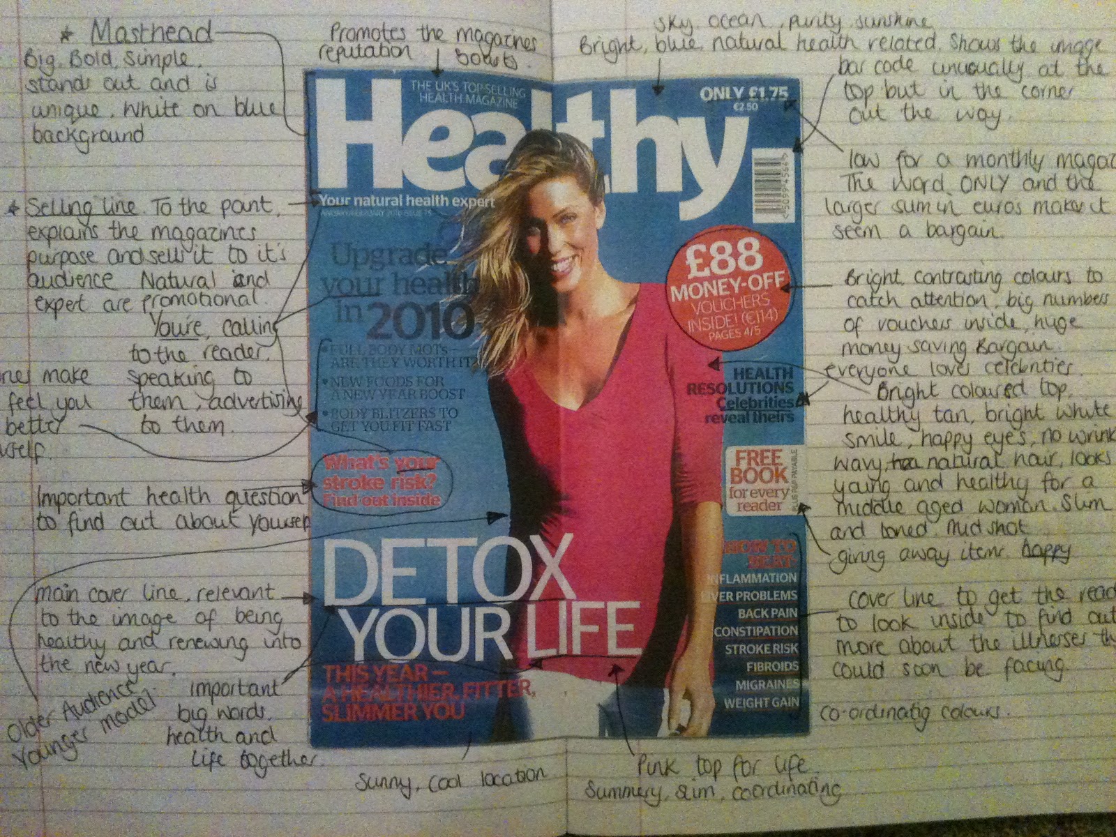
Over the past few lessons, we've been focusing on analysing magazine covers, and taking a look at their features, what makes it appealing, and what works best in our minds for different types of magazine cover. So far we've looked at a health magazine, which is sold in news agents, compared two university magazines, one for past students and one for current students and taken a look at our school prospectus. We've written notes on what works and what doesn't work for each and looked at each cover individually to analyse it. I've learnt that over crowding is not pleasing to the eye, and too much information on the cover can be a bit bombarding, putting the reader off. Too much colour can look over done and in your face, but too little can look dull. It's also important to aim the magazine cover at your target age group, making a magazine for older people look more sophisticated and using a younger model to make them think 'I could look like that and I want too.' Magazines aimed at younger people should be bright and slightly less sophisticated to look fun, but use a slightly older model to make them think it's 'cool' to read it, because older kids do. Big numbers, special offers, catchy cover lines and a bold, unique, memorable masthead is essential for people to remember and recognise your magazine among the hundreds of competitors. Here's an example of my analysis on the health magazine! ..
Subscribe to:
Post Comments (Atom)
No comments:
Post a Comment