Friday, 1 April 2011
Plans for my double page spread...
For my double page spread, I've decided to stick with the theme of black white and red to match the rest of my magazine. I've stuck with a black background to keep it consistent with a contrasting white for the text of the article so it stands out from the rest of the background, making it easier to read even though the font's small and compact.
My main focus will be on my title and image similarly to Rock sound and Kerrang's double page spreads. In order to do this, my image is on the right hand side of the page so it will be looked out automatically due to the mind working in chronological order. It will be a long shot at eye level that's focused on the front liner of the band playing live with another member of the band in the background along with the instruments and equipment in the mise-en-scene to show that they're playing live at a gig. I will leave them in colour, but will make them bright with lights from the background focusing on them to make them look important and focused on. It will mean that it catches the readers attention more. I will also include two smaller images on the top right hand corner of the other band members to include them and show that the whole band is interviewed. These two will be in colour similarly to the main image.
My title will be short and snappy, with a font colour and size change to highlight the main focus of the interview which in my case, will be the band name, as it's all about them. I've also decided to use a quote from the interview as the title as I thought it really worked well and fitted in well. The quote is relevant and short, with a form of humour in to make it look entertaining, as if the article will be. The font will match the rest of the article to fit in. It will be white with the band name in red to make most of it neutral, so the band name which is my focus, stand out as much as possible.
I've also decided to include some interesting, humorous quotes from the article spread out around the page near the images to entice the reader into reading the article due to it seeming entertaining. I've decided to place them by the images so that you will be drawn to the them after you've looked at the images. They will be in red and in the same font as the rest of the text on the page, which will be the same as the contents and front cover for consistency. They will also be in capitals. The capitals and the colour will separate them from the rest of the text and make them stand out which will also help catch the eye. They'll be separate from each other to look separate and not to look too much as the eye won't be able to focus on both.
I've decided to use a line similar to a selling line to introduce and sell my article to the reader. I've made it short, catchy and humorous, meaning it looks exciting, captivating, and makes you want to read on. It's white so it looks part of the article and it's bigger, stretches right across both article columns and bolder so it also stands out from the article. The article itself is separated into two columns chronologically so the audience will read down the left one and move up to the top of the right and read down again similarly to the fashion of both the magazines I have analysed. I also wrote it in story form, adding in little facts, and writing it as a flowing piece, making it easier to follow, and more interesting to the slightly older audience that I'm aiming at.
I've also decided to base the entire page solely on the article, with no section headings or separate article strips on the sides. I feel this way, it looks a lot more pleasing, less writing, and it looks more important, as if it deserves it's own entire double page spread. It makes it look more organised and not over powering on the eye.
I feel this layout will work well for my double page spread, however, am slightly worried that my article will end up too long to fit into the space I gave it, leaving less room for the image, which I want focus on too, but we will see! ...
Analysis of Rock Sound double page spread...
This double page spread is much more basic compared to the Kerrang one, which I personally prefer as it's focused purely on it's topic and has no distractions. The colour scheme is much different and a lot brighter, however, is still very co-ordinated, including with the pictures. The colours are a pastel blue and white, making it look very bright and easy on the eye. The subject is wearing black so he stands out from the picture and page, which is very appealing.
Again, the first thing I noticed was the image, due to the fact it's, similarly to Kerrang, on the right hand page. The Image is in original colour, with a scenery background so it's taken as a portrait. It's also an eye level closeup and focuses on the subjects face, with him looking directly at the camera. This picture straight away insinuates the article is purely about him. It's up close and personal similarly to the image, which is shown because of the images originality and the look about it that's planned. There's also a smaller image to create variety of a medium shot at eye level of the same person with the same facial expression, however, it's a medium shot so that you notice his arm as he's pointing at the quote next to him on the page. This makes the text and images interlink, making it easier on the eye. The image is also appears to be cut out, which adds a nice effect and looks separate to the text because of it.
The title isn't as large as I had imagined which means it doesn't jump straight out of you meaning you have to actually kind of look for it. I feel it should be bigger on most spreads, but on this particular one, it works well with the rest of the article and the image. The text is also written as if it's from the person themselves using the word 'my' four times. This makes it personal, as if the subject is talking to you. Again, the main part of the text is separated by font size. It's a lot larger and introduces what the entire article is about. Again, it's short, snappy and to the point which I like. The name of the person and the band they're from is also featured, making fans of the band more eager to read, and people feel like they know more about them if they don't already. It might also mean that some people discover the band.
The article itself is again written in newspaper/magazine article column form. It has nothing to entice the reader into reading further except itself but with a clear title, it doesn't really need it. The article is also written in story form about the interview with facts and small sections added in from the writer making it easier to read and more interesting. The article has a translucent background behind it to make it easier to read in front of the images background as the background doesn't completely contrast the white text. Again, it's small and compact, meaning more text can fit in, but there isn't too much text making it look pleasant and appealing. I particularly like how they've separated a particular quote that looks interesting and funny, meaning it's entertaining and made it bigger and put it on it's own out of the text. This will make the reader want to read through the text and read more. This is a clever technique.
Overall, I feel this simple layout with it's co-ordinated colour scheme and simple images and layout is appealing and pleasing to the eye and the only section I would change is the heading, just so it would stand out more and draw in the eye.
Again, the first thing I noticed was the image, due to the fact it's, similarly to Kerrang, on the right hand page. The Image is in original colour, with a scenery background so it's taken as a portrait. It's also an eye level closeup and focuses on the subjects face, with him looking directly at the camera. This picture straight away insinuates the article is purely about him. It's up close and personal similarly to the image, which is shown because of the images originality and the look about it that's planned. There's also a smaller image to create variety of a medium shot at eye level of the same person with the same facial expression, however, it's a medium shot so that you notice his arm as he's pointing at the quote next to him on the page. This makes the text and images interlink, making it easier on the eye. The image is also appears to be cut out, which adds a nice effect and looks separate to the text because of it.
The title isn't as large as I had imagined which means it doesn't jump straight out of you meaning you have to actually kind of look for it. I feel it should be bigger on most spreads, but on this particular one, it works well with the rest of the article and the image. The text is also written as if it's from the person themselves using the word 'my' four times. This makes it personal, as if the subject is talking to you. Again, the main part of the text is separated by font size. It's a lot larger and introduces what the entire article is about. Again, it's short, snappy and to the point which I like. The name of the person and the band they're from is also featured, making fans of the band more eager to read, and people feel like they know more about them if they don't already. It might also mean that some people discover the band.
The article itself is again written in newspaper/magazine article column form. It has nothing to entice the reader into reading further except itself but with a clear title, it doesn't really need it. The article is also written in story form about the interview with facts and small sections added in from the writer making it easier to read and more interesting. The article has a translucent background behind it to make it easier to read in front of the images background as the background doesn't completely contrast the white text. Again, it's small and compact, meaning more text can fit in, but there isn't too much text making it look pleasant and appealing. I particularly like how they've separated a particular quote that looks interesting and funny, meaning it's entertaining and made it bigger and put it on it's own out of the text. This will make the reader want to read through the text and read more. This is a clever technique.
Overall, I feel this simple layout with it's co-ordinated colour scheme and simple images and layout is appealing and pleasing to the eye and the only section I would change is the heading, just so it would stand out more and draw in the eye.
Adding the text... then FINISHED!
This was the easy part. All I had to do was create new text layers and place in the text where I wanted it. I used the same font throughout making it bold for photo captions and for headings. I make the headings and larges, numbers second largest, captions third and the list of contents smallest. I did decide to make the page titles larger and the description smaller however, as the titles should be bolder in order to catch the most attention. The numbers draw the eye to all of the different pages, and the captions are eye catching to be intriguing. I made the headings biggest as they are will be used to separate and organize the page. I used mainly white text with red numbers so not to over power the page, making sure it's still easy on the eye.
" Hey! my name's Kelsey and I’m the editor in chief of Novocaine. Welcome to our first ever issue! Wahoo! We promise new sound rock music, every good upcoming gig, music headlines, the good, the bad and the ugly album and gig reviews and every piece of fun and frolics we can get our mits on! so we can let this be the beggining of a beautiful music magazine era! thank you for buying Novocaine! "
I then wrote my editors letter. This wasn't tricky and didn't take to long, however, I did struggle with what to write. I decided to go for something informal to make it look friendlier, and to make it short but to the point. So here it is:
I believe it's very effective and adding my signature at the end made it more personal. I had trouble putting the editors letter in so that it was shaped around the image. I had to make two text layers and put some into one box, and the rest into the other. However, after succeeding with this, my contents page was finally complete!
Adding the images...
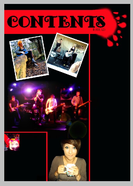
I'm now continuing with my contents page. The next stage was to add my images. This took quicker than I expected. I opened up the main image i was using in a new photoshop window. I added more contrast and made the vibrancy higher to make it look brighter. I also darkened the shaddows so that the background was darker, which I hoped would blend in with my background more. I then used the rectangular marque tool to select it and copy and paste it into my contents page. When I did this however, the image was far too big and took up the entire page! This was definitely not good! So I deleted it's layer and tried again. This time I had to rezise it, so i went to *image-image rezise* on the top menu and began to play around with the sizing, starting off by reducing the size and re-pasting it onto my contents page. It was then too small. I kept repeating my previous steps using trial and error until I finally got the size I wanted. Once it was onto my contents page, I then used the paint brush tool at 50px diameter with an edge hardness of 0% to colour in the edges of the picture black and allowing it to blend in with the background more so it didn't look too 'stuck on' and moved the image into the middle of the large section of the page.After being extremely pleased with the turn out of the image on the page, I began on my other images, starting with the one of the subways. I opened it in a new photoshop window and resized it first, making sure it fitted using my experience from the last photo. I then make the image brighter and added more colour saturation so it was a bit warmer. I then selected sections around the edge usig the rectangular marque tool and used the paint bucket tool to fill them in white so that it looked like a poloroid picture as planned. I then went to the top menu and went to *image-image rotation-arbitrary...* and changed it to 20degrees clockwise. The image rotated too far for my liking so I went back and changed it to 10degrees. The image looked better this time. Another problem I then faced was I couldn't use the rectanguilar marque tool to move it, so I had to use the polygonal lasso tool to select around the edge of the image. I then cut it and pasted it onto my contents page and moved it to the top right corner.
Adding the image of sophie was then proved easy due to needing to do exactly the same thing as I did with the Subways photo. However, this time, I also adjusted the colours so there was more yellow through it, making it look warmer and day dreamy. I added my border and I then resized it and rotated it 10degrees anti clockwise onstead of clockwise. Using the same method with the polygonal lasso tool, I cut out the image and pasted it onto the contents page, then moved it into position.
Adding my final main picture wasn't as problematic as my top two images, however, it still fared tricky. I started with just adjusting the saturation to make it warmer and the contrast to make it more defined before adding the picture in to the contents after resizing it and copying and pasting it in from a different window. I then realized it looked separate from the rest of the page so I tried using the brush tool with a black brush with a soft edge to blend it into the rest of the image, however, this didn't work too well. it looked obviously painted around and looked odd. I then decided to cut around the edge of Megan, as initially planned, to separate it from the rest of the page and make it blend in at the same time. I cut her out and pasted her on the contents page. This looked far better than before she was cut out and I was pleased with the outcome.
Adding the editors letter photo after adding in all of these previous photo's was a doddle! So I set off the same way as before, opening it into a new window and making it a lot smaller before copying and pasting it into the contents page and putting it in position. Finally.. all of my pictures are in!
Thursday, 31 March 2011
Analyzing a Kerrang! double page spread...
This double page spread is similar colours to my choice of colours throughout my magazine so I decided to use it.
The first thing I noticed is a large image on the left page. It's of the bands front man at a gig, live in action. It's sepia to blend in with the colour scheme, however, still stands out due to it's size. I noticed it first due to it's position on the left hand side page as I automatically read it in a chronological order from left to right. It's an eye level medium shot to show the stage and another band member behind him along with the microphone which shows that in the image, they're currently doing their job.. performing. There's also some smaller images of the rest of the bands across the bottom of the page to add more variety. As they're all the same colour, they blend in with each other easily.
The second thing I noticed and really liked the idea of was the title. It's a quote from the interview and it includes their name and the point of the interview. It's straight from their mouths and sounds interesting and dramatic. It makes you want to read on. I also like how the main part of the title is separated by font colour and font size. This means that the name of the band and the interviews point, in one line, completely stands out and catches the eye. Theirs also a form of selling line, as a description below the title, meaning the audience can find out more before they read further, making them more inclined to read further. The line is short and snappy and to the point.
The main text of the double page spread is in a small font and in sections like a magazine/newspaper article. It's very compact and tight together meaning there's more room for more text. It's written as if it's telling the story of the interview rather than a Q&A, meaning it contains more information and facts about the band rather than just the gossip that they've told us of, meaning musicians and fans will enjoy this!
There's smaller sections off of the page too including a heading in the top left corner reading 'News - World Exclusive'. It looks very important and as if the people reading it are about to find out everything before the rest of the world so that they can be at the top of the gossip. The news past gives a sense of organization. It's the same colour scheme as the rest of the page so fits well. There's a section at the right hand side of the page with the same colour scheme again, however, it's layed out differently to separate it from the page. It again adds variety, however, I feel it makes the page look too much on the eye and can come across a little bit dramatic.
The colours are simple, with a dark black background that blends in with the background of the image, with red highlights to make some things stand out more, and white font to keep the page looking more neutral and easy on the eye. Using the white over the black also makes it really easy to read despite the font being really small due to the colour contrast. Overall, I feel this layout is very effective, however, I also feel it is a bit uneasy on the eye as it features so much.
The first thing I noticed is a large image on the left page. It's of the bands front man at a gig, live in action. It's sepia to blend in with the colour scheme, however, still stands out due to it's size. I noticed it first due to it's position on the left hand side page as I automatically read it in a chronological order from left to right. It's an eye level medium shot to show the stage and another band member behind him along with the microphone which shows that in the image, they're currently doing their job.. performing. There's also some smaller images of the rest of the bands across the bottom of the page to add more variety. As they're all the same colour, they blend in with each other easily.
The second thing I noticed and really liked the idea of was the title. It's a quote from the interview and it includes their name and the point of the interview. It's straight from their mouths and sounds interesting and dramatic. It makes you want to read on. I also like how the main part of the title is separated by font colour and font size. This means that the name of the band and the interviews point, in one line, completely stands out and catches the eye. Theirs also a form of selling line, as a description below the title, meaning the audience can find out more before they read further, making them more inclined to read further. The line is short and snappy and to the point.
The main text of the double page spread is in a small font and in sections like a magazine/newspaper article. It's very compact and tight together meaning there's more room for more text. It's written as if it's telling the story of the interview rather than a Q&A, meaning it contains more information and facts about the band rather than just the gossip that they've told us of, meaning musicians and fans will enjoy this!
There's smaller sections off of the page too including a heading in the top left corner reading 'News - World Exclusive'. It looks very important and as if the people reading it are about to find out everything before the rest of the world so that they can be at the top of the gossip. The news past gives a sense of organization. It's the same colour scheme as the rest of the page so fits well. There's a section at the right hand side of the page with the same colour scheme again, however, it's layed out differently to separate it from the page. It again adds variety, however, I feel it makes the page look too much on the eye and can come across a little bit dramatic.
The colours are simple, with a dark black background that blends in with the background of the image, with red highlights to make some things stand out more, and white font to keep the page looking more neutral and easy on the eye. Using the white over the black also makes it really easy to read despite the font being really small due to the colour contrast. Overall, I feel this layout is very effective, however, I also feel it is a bit uneasy on the eye as it features so much.
Cracking on with my contents page ...
I started with a blank A4 background which i then filled in black with the paint bucket tool. I then created the basic layout. I used the rectangular marque tool to select a large rectangle strip across the top three quarters of the page. I then used the paint bucket tool to fill in the rectangular box which will be what my heading 'Contents' will be in. I then used the rectangular marque tool again to separate a small strip down the page that came off of the top strip then I filled it in red. I then created a little box using the same technique down in the bottom left corner to separate the part I will put my editors letter into. I then created the splodge similarly to the cover. I created a small red splodge at the end of the red strip with the paint brush tool using a 401px master diameter and an edge harness of 75%. I then used a smaller master diameter of 50px with the same edge hardness to make the small blobs coming off. I then used the smudge tool to smudge out the edges of the little blobs to make it look as if they're dripping. However I feel I should have spend more time perfecting this. I found it hard to get the marque box small enough to make the separating lines, however, I figured out that I could make a slightly thicker red line, then use the marque tool again to select the edges around it and fill them in black to make it thinner. I then put in the text 'CONTENTS' and the issue number.
So I finally had a base together! Wahoo!
Pictures for my contents page!
The main image which will be right in the middle of the images half of my contents page is of a band playing a live gig. It looks exciting and relevant to what the magazine is about. I've decided to blur everything around the main singer to focus on him and make the picture look as if there's going to be more. I used a long shot of the band with an eye level angle to make it look like a member of the audience standing back and watching, so the audience looking at the image will feel there and feel in touch with the photos. This also means they look life size almost, and the audience can see the stage, guitars, drums and equipment around them to show it's at a live venue. It's dark with bright colours to catch the eye as it will be the main focus.
My second image is of a popular band, and I've decided to put it into the form of a polaroid picture with a white frame around it to separate it from the background. This will then separate it from the rest of the page, making it look separate and like an add on. The whole band is featured in it and again, it's live and looks entertaining as the whole band is moving around and looks involved. I've used a medium long shot again at eye level of the band to symbolise I've gotten closer up to them in order to please my audience. Again, This makes it easier for the audience to see the instruments, light and equipment and see that it's a live gig at a venue. I've used a hand in front saying 'The Subways' to show the fans, and made the picture light and realistic colours to look as if it's there. it looks like a live gig and looks fun!- The image I've used of Sophie is more of a portrait shot to add variety. It looks personal, showing the magazine has taken the time to come face to face with the artist and the audience will want to hear what she has to say as the magazine will have what she's directly said. It's based on her having inspiration so had to be different and dreamy, as if she's escaping the world so where better to take it than a woods? she's pictured on her own with just her guitar. I've used a medium long shot at a low angle of her sitting down playing guitar and looking into the distance to symbolise her being day dreamy, and distance, with the camera hiding so not to distract her, like a fox watching a rabbit. It's looks as if she's in her own little world, brilliant!
- The final main image I've used is a Portrait of a Megan drinking tea. I've used a medium shot to get in her happy, satisfied expression and the cup in her hand. Due to it's irrelevance to music, it sparks a curiosity of what she's up to and what's going on. This makes the audience want to carry on looking through the magazine to see. It's bright with not too much mise-en-scene to keep it simple. I will cut around her so that she stands out and make her look blended in with the background, as if she's just there.
I have also included a small image of myself in the editors letter section. It's small so it looks out of the way, but bright to catch some attention to the letter. I've put it there so the audience can put a name to the face to gain a personal connection.
Subscribe to:
Posts (Atom)